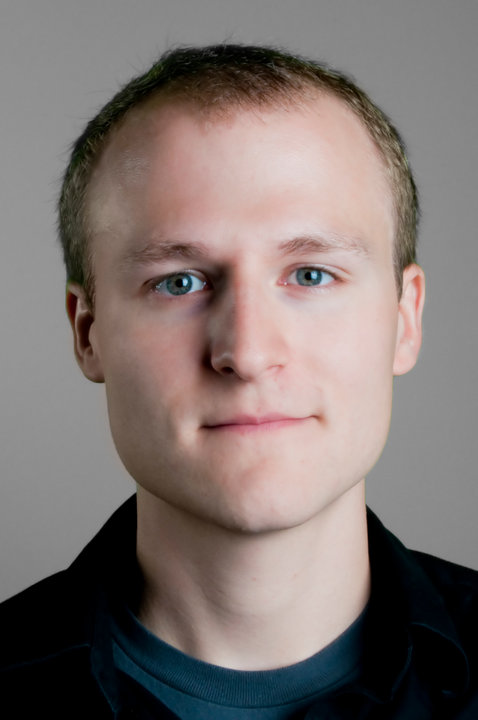
Here's a project I started working on more than a year ago. The concept is quite clearly property of LucasArts but I wanted to see to what extent I could replicate the look of their model.
I began as usual with drawing edge loops on the reference image.

Then I moved onto the modelling.

And lit.


Looks good.
ReplyDeleteIf you want critique, I'd say:
The top of the head should be squarer.
The upper part of the cheeks near the eyes could use some more work. They seem to be defined much better in the reference. Look at how the light falls on it. You might also be able to push out the cheek bone too to get that nice contrast between cheek and jaw.
You could probably push the eyebrow furrow a bit sharper and deeper.
When you get to the ears, they could stand to be rotated forward a bit more.
Sink them eye sockets in man. It's either that or bring out the cheeks more. Or a bit of both. Look at how much shadow is falling on the guys eyes in the reference and how in the 3/4 his cheek area near his temple comes out more, giving the sense that the eyes are situated securely in his head.
word. I see what you're saying. The eyes and cheeks were all from last September. I'll go back and fix those parts up when I put in the mouth bag
ReplyDelete